Modes of Representations in American Landscape and Garden Design
Anne L. Helmreich and Therese O’Malley (2010)
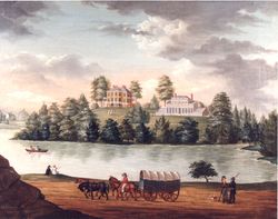
This essay introduces the categories of visual representations of gardens, landscapes, and landscape features used in HEALD and considers how these materials contribute to a fuller understanding of the history of American landscape design. From the purportedly empirical mode of map-making to the fanciful world of imagined landscapes, what all the images on this website have in common is that they provide a conventional basis with which people can communicate with others the social production and materialization of a design, recording of a place, or sharing of an imagined fantasy and actual experience.[1] This idea, articulated by Edward Robbins in Why Architects Draw, is fundamental to this study, which assumes that all representations of the designed landscape have been shaped by the conventions associated with a particular medium or genre and by the cultural context in which the representations were produced and circulated.[2] The very materials of an image—oil on canvas, painted ceramics, furniture, or printed advertisement, all of which were used to represent the designed landscape—can dictate, to a large degree, its function and suggest to whom it was directed and how it was intended to signify to its intended receiver(s) [Figs. 1 and 2]. The image’s medium and form were sometimes determined solely by its makers, sometimes by the dictates of a patron/commission, and often by a negotiation between the two. Using an image as a source of information about the designed landscape, therefore, requires visual analysis in concert with an understanding of the complexity of image-making and reception. It also demands recognition that we are often seeking information of the image that it was perhaps never intended to provide. In other words, we must consider whether an image was intended to convey information about the designed landscape and, if so, how that information may have been shaped by the demands of ideology and/or aesthetics, or if, as is the case in many of the works collected for this study, conveying information about the designed landscape was only incidental to the image.
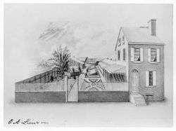
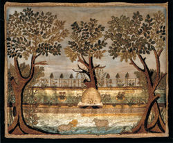
The body of visual material used in this study can be categorized into two broad groups: reproductions, whether bound in books or in the form of single sheets; and unique objects, including paintings and drawings. Like other forms of early American material culture, many images of gardens accessible to us today are the survivors of history because of the short-lived nature of their intended use. As a result, widely reproduced and disseminated prints represent the largest portion of the works collected here. Plans and drawings made for specific sites were more vulnerable to destruction, not least because those used in the construction of gardens suffered from use and exposure to the elements. Many of the drawings in our study have been preserved because they were associated with a well-known individual or site. Working and presentation drawings for public sites commissioned through open competition have a relatively good rate of preservation through the efforts of local, state, and federal archives. Nevertheless, when compared to the body of extant architectural drawings from this same period, the corpus of preparatory or presentation landscape drawings is small. Whether their scarcity today reflects rarity of preservation is unclear. Oil paintings have often been preserved by virtue of the relative importance of the artist, the individual or site depicted, or the intrinsic value of the high-art medium of oil painting. Far more vulnerable to destruction have been such media as wall frescoes; Rufus Porter (1792–1884), for example, decorated numerous homes in New England, but today his work is represented by only a handful of extant examples. A small number of household objects recording landscapes, such as samplers, ceramics, and painted furniture, have been preserved, often through the interests of collectors such as Abby Aldrich Rockefeller [Fig. 3].[3]
Illustrated Books and Periodicals
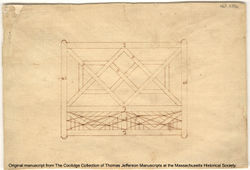
As in the closely aligned field of architecture, illustrations in published volumes played an important role in the dissemination of landscape and garden-design principles. Treatises communicated visual information about the design, construction, and embellishment of gardens through didactic illustrations of topics such as the layout of the kitchen garden or the proper manner of ornamenting a lawn. Treatise illustrations were on a par with fine art printmaking in terms of the quality of the workmanship and the handling of the medium. The finely worked perspectival views and allegorical scenes used as frontispieces indicate that many garden treatises were costly items intended for the library of a gentleman collector rather than the workroom of the gardener.[4] Recognized artists were often commissioned to make illustrations: Philip Miller’s The Gardeners Dictionary (1731), for example, included prints by the well-known German botanical illustrator Georg Dionysius Ehret (1709–1770). High-quality illustrations were regularly included in treatises imported from Great Britain in the 18th century, such as John Evelyn’s translation of Jean de la Quintinie’s The Compleat Gard’ner (1693),[5] John James’s 1712 translation of A.-J. Dézallier d’Argenville’s La théorie et la pratique du jardinage (1709),[6] and Batty Langley’s New Principles of Gardening (1728).[7] Moreover, there is ample visual evidence that Americans actively consulted and used such imported treatises. Thomas Jefferson’s design for a decorative out-chamber was based on plate 73 in William Kent’s Designs of Inigo Jones (1727) [Fig. 4], his Chinese lattice gate was inspired by William Chambers’s Designs of Chinese Buildings (1757) [Fig. 5], and his niece’s drawings of garden seats were based on designs by William Kent in William Chambers’s Plans, Elevations, Sections, and Perspective Views of the Gardens and Buildings at Kew in Surrey (1763).[8] The New England architect Samuel McIntire, who designed garden structures in addition to residential and public buildings, adopted and modified elements from both a wide array of European and British architectural theorists, including Andrea Palladio, Batty Langley, and Isaac Ware, as well as from American architectural treatises, such as Asher Benjamin’s The Country Builder’s Assistant (1797) and The American Builder’s Companion (1806) [Figs. 6 and 7].[9]
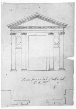
Innovations in printmaking technology toward the end of the 18th century reduced the cost of printed illustrations, leading to a boom in illustrated books generally; the authors of architectural and gardening treatises eagerly exploited these new media. Humphry Repton used advances in aquatint publishing to produce his Sketches and Hints on Landscape Gardening (1794), Observations on the Theory and Practice of Landscape Gardening (1803), and Fragments on the Theory and Practice of Landscape Gardening (1816), which reproduced “before and after” sketches that he created for clients in his “Red Books.” These printed volumes, collected by Americans as well as British, were a calculated venture on Repton’s part and intended to cultivate upper-class clients.[10]
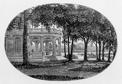
By contrast, the British treatise writer John Claudius Loudon and his American disciple, Andrew Jackson Downing, used relatively inexpensive wood engravings to illustrate their respective encyclopedias and treatises.[11] The illustrations that A. J. Davis prepared for Downing’s books were drawn on woodblocks and engraved by wood carvers such as Alexander Anderson, America’s first important wood engraver. In 1838, Downing commissioned Davis to prepare illustrations for his first book, A Treatise on the Theory and Practice of Landscape Gardening, Adapted to North America (1841). This led to a twelve-year period of collaboration as Davis both supplied his own designs and corrected and amplified Downing’s designs for his journal, The Horticulturist [Fig. 8].[12] In Davis and Downing’s volumes in particular, a close correspondence between treatise and practice in landscape design becomes evident by virtue of developments in printing technology that allowed illustrations to be inserted into passages of text. Unlike earlier garden treatise illustrations, these illustrations frequently represented sites and objects in perspective, surrounded by plant material, and were thus perhaps more easily imagined as realizable.[13] For example, when Downing asked Davis to create new images for the revised, second edition of his Treatise, he asked for vignettes that placed “the house more distant and showing more trees and grounds—than in those other cuts,” that were more “landskippish,” to use Downing’s term.[14] Such images addressed new audiences for treatises, which included not only craftsmen and master builders (including gentlemen amateurs), but also potential middle-class clients who were interested in the values of style as explained by writers regarded as knowledgeable professionals. Moreover, by discussing and picturing the house in relationship to its environment, Davis and Downing promoted their agenda of unifying and stylistically thematizing house and grounds, thus creating a niche for their services as both architect and landscape architect. The number of buildings erected following Downing’s designs indicates their enormous popularity with the middle classes. The success of Davis and Downing’s treatises can also be judged by the number of architects who followed their model; for example, in his treatise The Architect (1849), William Ranlett published lithographs of perspectival views and ground plans by Frances (Fanny) Palmer after his proposed or executed designs [Fig. 9].[15] Treatise literature was also instrumental in promoting the use of drawings to aid in the process of designing and building gardens and landscapes. One chapter in Dézallier d’Argenville’s The Theory and Practice of Gardening (1712), entitled “Of the Manner of tracing out all Sorts of Designs upon the Ground,” described how to transfer the scaled plan “designed upon a Roll of Paper” to the ground through a system of measuring and staking that was akin to surveying.

Dézallier d’Argenville provided exacting instructions for different methods of preparing drawings that could be easily followed by both the designer/surveyor and the planter.[16] Although the features described in Dézallier d’Argenville’s text, such as parterres and bowling greens, declined in fashion in the 19th century, his instructions for a design process that emphasized the making of drawings continued to be used. J. C. Loudon, in his chapter “Transferring Designs,” also recommended the same technique, reproducing figures from the Dézallier d’Argenville treatise to illustrate his point [Fig. 10]. Treatise writers in the period between Dézallier d’Argenville and Loudon also recommended using drawings to guide the design process. Stephen Switzer, in his Ichnographia Rustica (1718), advised the following:
[W]hen, therefore, you have fix’d upon the Center of a Design, (viz.) the Place where the House is to be, and have from thence taken the Survey of your Ground round, and the same is plotted on Paper; you are to begin to cast it first on a Method on Paper, I mean, that Part that lies next the House, which is intended to be divided into Court Yards, Parterres, &c.[17]
And Batty Langley (1728), like Dézallier d’Argenville, included a chapter on geometry to help his readers solve problems of scale and proportion.
Design Documents: Sketches, Working Drawings, Presentation Drawings
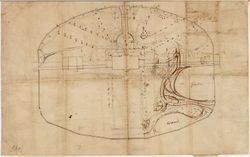
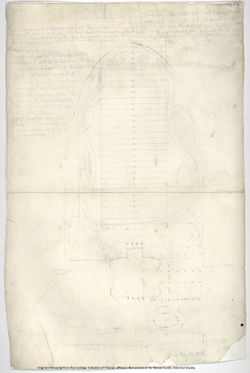
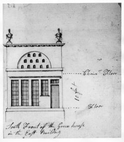
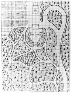
While treatises clearly provide exemplars of design, we find that sketches, working drawings, and presentation drawings take us much closer to the actual production of designed landscapes. They are not just graphic expressions of what one sees but also the record of processes of thinking, creating, and imagining.[18] Presentation drawings, which were intended for the client or the public, were often highly finished, employing perspective views that, according to James Ackerman, tended toward rhetorical exposition.[19] In contrast, sketches and working drawings were used by the designer, builder, and gardener to work out design proposals and guide construction. Latrobe’s sketch for the White House grounds made around 1807, for example, is loosely drawn, and particular areas have been redrawn several times [Fig. 11]. Thomas Jefferson adopted the practice of drawing on coordinate or gridded paper to develop his designs and perhaps help transfer them to the ground. These drawings, of varying degrees of finish, are heavily annotated with specific botanical names and instructions, indicating that these drawings were an essential part of his working process as well as a means of communicating his designs to others [Fig. 12].[20] In response to George Washington’s questions in 1784 regarding the internal construction of the orangery at Mount Clare, Tench Tilghman supplied Washington with a written description of the flues as well as a sketch.[21] Washington, in turn, produced sketches of the greenhouse as instructions for his workmen [Fig. 13].
Benjamin Henry Latrobe’s innovative use of the perspective drawing allowed the building to be shown in situ,[22] and encouraged a relative broadening of the graphic means employed in architectural drawings, including “an optical use of colors, shades, and shadows along with landscape settings to project the visual effect of a finished design.”[23] Latrobe was proficient in watercolor and exploited its potential to achieve both detail and breadth in his perspective renderings. As William H. Pierson Jr. has argued, watercolor “opened the way for the full development of those visual qualities so essential to the picturesque—irregularity, variety, and contrast.”[24] Born in Britain, Latrobe received professional training as an engineer before moving to America in the 1790s. His influence on American architecture is due not only to his buildings but also to those of his students, including Robert Mills [Fig. 14], Frederick Graff, William Strickland, and Strickland’s student Thomas Ustick Walter, whose designs reveal an interest in the techniques of three-dimensional representation introduced by Latrobe. A. J. Davis, who had attended the Antique School in New York (later renamed the National Academy of Design), also made use of painterly means in his architectural drawings. Davis attached much significance to drawing as revealed by the passage from J. C. Loudon that he transcribed (loosely) in his notebook:

Drawing has now become an essential part of polite education. The mere circumstance of familiarizing the mind with orderly arrangement, regular figures, symmetry, and means adapted to the end in view, either in buildings, in furniture, or fundamental principle of all morals; for what is immorality but a disturbance of the order of civilized society, a disturbance of the relations between man and man? We do not say that all kinds of drawing have a tendency to produce an orderly mind, but we do affirm that architectural drawing has that tendency in an eminent degree.[25]
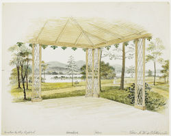
Davis’s drawings of Blithewood, Robert Donaldson’s estate near Tarrytown, New York, presented the building in harmony with its surroundings: “irregular and suited to scenery of a picturesque character” [Fig. 15].[26] Davis depicted the house in a park-like setting with a flower bed just before the front door and vegetation planted along the approach. In the view of the veranda, he made the connection between the house and the landscape even more explicit; rather than showing the house, the watercolor presents the view from the veranda to the river below and the pathways leading from the house to the park beyond (see Piazza). The floor plans of Davis’s and A. J. Downing’s “rural architecture” show a strong interest in porches, porticoes, verandas, and conservatories, architectural features that connected the house and its surroundings [Fig. 16]. These designs, reproduced in the popular architectural and landscape treatises of the mid-19th century, are significant here since they are often clearly labeled and are therefore useful in identifying liminal architectural structures and analyzing how they acted as physical links between the residence and the landscape.
Cartography
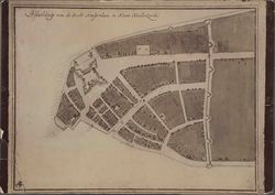
Maps were crucial to the early history of America as records of exploration and settlement.[27] When reproduced in print form and disseminated as single images or bound in published texts, they played a formative role in shaping public perceptions of the use of design. At the same time, they could transmit to their audiences the cultural biases that historians have long noted were inevitably exposed in the process of map-making. Joseph S. Wood described how on maps of New England villages meeting houses “were often exaggerated beyond proportion,” drawing attention to their social prominence within the community.[28] The Castello maps of New York (first executed in 1660 and redrafted the same year) are an excellent case in point [Fig. 17]. The subdivided and elaborated spaces punctuating the urban landscape have been construed as gardens, and, indeed, were interpreted as such by the directors in Amsterdam who complained of the excessive space given over to gardens. Yet, it should be remembered that the map functioned as a sort of annual report from the city burgomasters, who may have been inclined to overstate to what degree the lands of New Amsterdam were under cultivation. Moreover, in many early maps it is difficult to determine if gardens actually existed as portrayed or were simply part of the mapmaker’s vocabulary for indicating a settled region.

In the colonial period and into the 19th century, many cartographers and landowners were engaged in surveying and measuring the landscape, including George Washington (whose first profession was surveying) and Thomas Jefferson, who made maps himself and who set out a system of land survey in the Northeast Territory that was extended to the trans-Mississippi West [Fig. 18]. Early maps and surveys show a broad range of design scales, on the level of city and state or of plantation and estate. Legends, keys, and inscriptions used in these documents to name features and sites and provide locations have been essential in this study to linking terminology and feature.
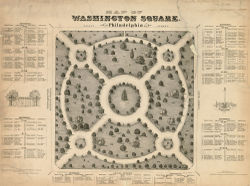
Attendant upon the public land survey of America and accelerating settlement after the end of the 18th century, rural areas and, in particular, townships were mapped with increasing frequency. With the growing interest in improving urban spaces, 19th-century city mapmakers took pains to record public parks and gardens in detail. An example is an 1843 lithograph of Washington Square in Philadelphia that records the more than fifty species of trees planted in the 1820s [Fig. 19]. The borders of the park and the circulation system are shown in the plan, but the landscape is represented as a highly abstract elevation of trees, each drawn distinctly, quite removed from what Karen Tehve has described as “approximating a phenomenological substance.”[29] The text provides the true identification of the design elements, with botanic and English plant names.
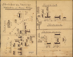
While the majority of urban maps in this study are in the print medium, many unique manuscript maps were made to circulate within a small community, such as maps of Shaker communities. Robert Emlen has analyzed how Shaker maps shifted from basic site plans to drawings employing two systems of perspective—“sketching elevations of the buildings in combination with a plan of the site”—that could indicate both the scope of the property and its development.[30] Emlen argues that Shaker village maps “were used as planning tools for active villages” [Fig. 20].[31] While strict plan views and bird’s-eye views became the mode of choice for professional cartographers, the Shakers produced unique drawings by combining different systems of representation to help members “visually organize and comprehend a large and complex property” and to create a repository for a unifying communal memory.[32]

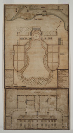
Maps vary in detail from those showing general outlines of property boundaries to detailed plans indicating the smallest particulars of a landscape design. The former functioned to record the extent of property, while the latter often recorded the improvements (in both the landscape and the architecture) undertaken. The variation among different modes of representing the landscape is exemplified by four approximately contemporary maps or plan views of Mount Vernon. The survey of Mount Vernon and neighboring estates drawn by George Washington in December 1793 provides the location of his various farms and their division into fields, indicated by numbered lots with occasional inscriptions. Areas not under cultivation are indicated by a system of outlined trees and hatched lines. The representation of the ornamental landscape around the mansion house is denoted simply by the lyre-shaped approach to the house and dependencies. By contrast, the ground plan of the house lot that Washington commissioned from Samuel Vaughan was undertaken on a scale much smaller than that of the survey and, therefore, provides a great deal of specific information about the ornamental landscape. Vaughan, for example, indicated the shrubberies that lined the approach, the upper and lower gardens, the groves that flanked the house, and the deer wall protecting the lawn [Fig. 21]. The drawing’s legend indicates the important design features of the landscape. Two insurance surveys from 1803 and 1805 provide another type of survey, richly informative because of their inscriptions and detailed rendering of the features of the plantation house and ornamental grounds from a legalistic perspective. Detailed estate plans are rare but rich with terminology and design information. John Nancarrow’s plan of the seat of John Penn (c. 1784) provides a valuable level of detail, with the addition of a key that names several garden features, including a wilderness, bowling green, flower garden, and ha-ha [Fig. 22].

Plan views were also made to record the designed landscape at a particular moment and to provide a foundation from which to plan future changes. One of the earliest, securely dated site drawings in this study is a March 1762 plan for a garden apple nursery that John Pickering (a resident of Salem, Massachusetts) drew in his day book as a record of his planted trees [Fig. 23]. Eighty years later, Daniel Gould, probably of Salem, Massachusetts, began a record of his garden, and indicated where individual trees were planted by using a system of numbers inscribed on a sketchy plan view [Fig. 24].
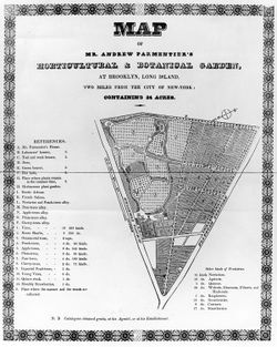
Some estates surveys or plans were published in treatises and periodicals and thereby served as exemplars or models. The commercial gardener André Parmentier published a broadside of his garden, shown in plan view with a key identifying different features and the contents of marked beds, which was disseminated through such publications as the New England Farmer, in which it was recommended as a paragon: “one of the few examples in our neighborhood, of the art of laying out a garden so as to combine the principles of the landscape with the conveniences of the nursery or orchard: and every proprietor who may have a piece of land which he wishes to arrange and embellish in this manner may find it to his advantage to consult Mr. Parmentier” [Fig. 25].[33]
Topographical Views
In addition to surveys and map-making, topographical views, which most often took the form of bird’s-eye prospects, were among the earliest representations of the American landscape. Scholars argue that the bird’s-eye view perspective became the cartographer’s preferred representation because it supported an illusion of coherence and order. It was also a pictorial convention more widely understood than orthogonal drawings such as plans.[34]

As Edward Nygren has demonstrated, the form and content of topographical views were shaped by the desire to show the New World as prosperous. In the case of the Fourdrinier print of Savannah, Georgia, the woods have been pushed back to make room for a symmetrically laid-out city, filled with identical houses and nearly barren of vegetation. According to Nygren, “It portrays a world being transformed, controlled, and tamed by European civilization” [Fig. 26].[35]
In the late 18th century, landscapes purporting to depict an accurate, or unmediated, vision of the land began to give way to landscapes that exhibited the characteristics of the “picturesque.” This term was applied to landscapes that exhibited the aesthetic qualities of landscape “pictures” as they had been developed by landscape painters during the previous two centuries. It owed its origins to the Rev. William Gilpin, who developed the concept in his accounts of his tours of Britain during the 1780s. Rejecting Edmund Burke’s aesthetic dichotomy of the sublime and the beautiful, Gilpin added a third term—the picturesque—which was characterized not by the dramatic mountainous landscapes of the sublime nor by the smooth rolling hills of the beautiful, but by variety, irregularity, and roughness. This new aesthetic category had a tremendous impact on landscape gardening in both Britain and the United States and led to hotly debated guidelines for the production of designed landscapes.[36] A fashion for picturesque tours, during which tourists could undertake their own picturesque sketches as instructed by the innumerable guidebooks to sketching and view-making produced at this time, created a market for souvenir prints of picturesque sites and views [Fig. 27].
Portrait and Landscape Painting
The tradition of producing portraits or views of country houses can be traced back to at least the 16th century in Britain, and the tradition was quickly adopted in the colonies once the proper conditions for patronage developed.[37] Country house portraits could memorialize or represent a site in accordance with the owner’s conception of self-identity, refashioning the house and topography in accordance with prevailing codes of wealth and status.
How depictions of elite houses functioned as both interior decorations and social signifiers is expressed by an October 12, 1756, letter from Henry Laurens to Richard Shubrick:
Our Brother Elias Ball who has lately finished & got into his new house is desirous of completing the decorations within by adding two handsome Landscapes of Kensington & Hyde Park [two plantations on the Cooper River, SC, owned by Elias and John Corning Ball] which will just fill up two vacancies over the Chimney pieces in the Hall and a large Parlour. . . He would have handsome Views of those two places with the adjacent Woods, Fields, & Buildings & some little addition of Herds, Huntsmen, &ca., &ca., but not too expensive in the Painting.[38]
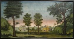
In short, Elias Ball wanted depictions of two nearby estates that would be readily recognizable and would fulfill his expectations of both decoration and landscape painting while making the extent of his property and social network visible to visitors. Ball appears well aware of the British precedent of overmantel and overdoor paintings as inexpensive substitutes for the large murals found in royal and aristocratic interiors.[39] Overmantel paintings, as well as large wall frescoes or painting on paneling, date to at least the early 18th century in the colonies. As Nina Fletcher Little has observed, these paintings can be divided into three categories: those composed on the spot “from nature,” those that combined imaginative features with those observed from nature, and those that were almost entirely “inspired more or less directly by recognizable sources of design” [Fig. 28].[40] The early 19th-century itinerant, self-trained painter Rufus Porter also advocated working from preexisting models: In several articles written for Scientific American in 1846 and 1847, Porter produced prints of landscape scenes that he argued could be copied or used as stencils to produce decorative wall paintings as fine as more expensive wallpaper. His vision of the ideal landscape was an assemblage of features recognizable from everyday experience:
Some of the most prominent objects and scenes which may be often repeated, though under different arrangements, are farms, fields, forests, farmhouses, palaces, arbors, wind-mills, observatories, villages, high rocks, ships, steamboats, sail-boats, islands, hunting scenes, carriages, cattle feeding or watering, children at play, military parades, water-falls, flower gardens, flocks of birds, balloons, canals, water-mills, railroads, bridges, &c. There must be a general consistency observed, and one scene made to connect with another, even although the different scenes should represent different seasons of the year. . . The learner, for the purpose of acquiring the art of designing, should habituate himself to making close observations of objects, and scenery, and to imagine various scenes in his mind, diverse from anything he has seen, and practice sketching such designs when his mind is most free from other cares.[41]
While oil paintings of houses were generally intended for those who owned private homes, View of the Seat of His Excellency John Hancock, an engraving reproduced in the Massachusetts Magazine in July 1789, would have enjoyed a much wider audience. This print reveals the adoption of some of the key motifs of 18th-century British country house portraiture in the American context. The bird’s-eye or elevated viewpoint has been dropped in favor of an eye-level frontal view that encourages a more direct relationship between the object depicted and the spectator. The inclusion of a figure looking to the house, in the left-hand corner of the print, reinforces this relationship by creating a voyeuristic stand-in for the implied viewer [Fig. 29].

The chief practitioners of American country house portraits around the turn of the century were William Groombridge (1748–1811), Ralph Earl (1751–1801), Francis Guy (1760–1820), Benjamin Henry Latrobe (1764–1820), and William Birch (1755–1834), all of whom received training in Britain.[42] While Ralph Earl worked primarily in New England [Fig. 30], the rest worked largely in Philadelphia, where the wealthy villas along the Schuylkill were said to emulate those along the Thames.[43] Other regions boasting concentrations of wealthy houses and great plantations, such as the Chesapeake area and Charleston, South Carolina, were also popular sites for touring and sketching. Among the best-known examples are the works of Anne-Marguerite-Henriette Rouillé de Marigny Hyde de Neuville and Anthony St. John Baker, who both visited and sketched the famous sites of Washington, DC, in the early 19th century, and those of Charles Fraser, a miniaturist and lawyer who produced numerous depictions of the great houses and monuments of the Charleston region.[44]
Designed landscapes were often featured in portraits executed in the grand manner tradition. Portraitists looked to the example of English painters such as Thomas Gainsborough to place their sitters in harmony with the natural world, as in Ralph Earl’s 1789 portrait of Daniel Boardman [Fig. 31], or placed them reposing indoors by a window, a motif that can be traced back to at least the 16th century. Despite the conventionalized aspects of portraiture, the genre remains a valuable source of evidence for the history of the designed landscape. As suggested above, portraits vividly convey the social status and importance assigned to gardens, gardening, and other horticultural practices.[45]
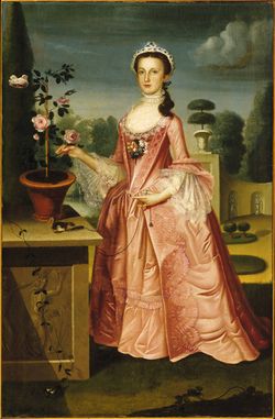
As in the case of architectural and topographical landscape drawing and painting, English models were brought to America through British-trained artists and prints. William Williams’s portrait of Deborah Hall is a case in point. Williams, originally from Bristol, England, settled in Philadelphia around 1740 and was one of Benjamin West’s early teachers. Williams’s Portrait of Deborah Hall (1766) exemplifies the Rococo style, using pastel colors and a highly theatrical landscape setting.[46] Hall reposes in a landscape filled with symbolic features meant to refer to her upbringing and status: the pedestal frieze displays the virginal Diana transformed into a laurel tree to escape the advances of Apollo, and the leashed squirrel connotes both the taming of the wilderness and the restrictive lifestyle of a genteel, well-to-do young lady [Fig. 32].[47]
Portraits of individuals and houses functioned, therefore, not only as a means of conveying information about the sitter or the site. They also embodied the ideals and ideological imperatives shaping the presentation of the self and one’s surroundings in the colonial and federal periods. These ideals and ideologies were given weight and credence largely because they were inscribed in an artistic language that, in the eyes of makers and patrons, validated them as real and natural.
This artistic language of portraiture, derived from academic traditions and disseminated by drawing manuals and other didactic materials, belonged to the professional artist, although amateurs often aspired to acquire proficiency in the requisite skills. However, a significant portion of art production, particularly in early America, fell outside the prescribed bounds of professional art-making and the language of the academic tradition and its rules regarding line, space, and form. Images lacking reference to the professional or academic language of art-making have been described as “naïve” or “folk” art.[48] Although works by so-called “naïve” artists often eschewed naturalism and therefore may seem problematic for historians seeking to uncover the former appearance of the built environment, these images are nevertheless an important source of information about attitudes to the designed landscape and how the landscape was ordered and perceived. Images of the house and surrounding landscapes in media that were traditionally associated with women’s artistic practice, such as needlework, for example, reinforced the prevailing notion that the house was the natural and proper sphere of women. Such images also shed light on aspects of social practice that were largely held as the province of women. Early 19th-century illustrations of burial grounds and grave markers executed by untrained artists depict the cult of mourning and sentimentality that developed in this period (see Cemetery). The Memorial to Jacob Cushman, executed in silk embroidery and watercolor on silk, was completed by Mary Cushman as part of her lessons at Miss Mary Balch’s school in Providence, Rhode Island. [Fig. 33].[49] Such imagery reiterates the importance of mourning as a genteel activity and reveals the relationship between such social practices and the physical spaces of the landscape.
The conventions of art-making in the late 18th and early 19th centuries reflected and shaped landscape and garden design. During most of the period under study, garden design and landscape imagery influenced each other in a reflexive exchange of conventions, aesthetics, and ideas. In 1752, the horticultural agent Peter Collinson wrote that the practice of garden design, “to embellish Nature by plantations,” was another means of “painting with Living Pencils.” Likewise, the painter Samuel Morse, who served as president of the National Academy of Design from 1826 to 1842, included landscape gardening in his Lectures on the Affinity of Painting with the Other Fine Arts, delivered in 1826. Like numerous aestheticians before him, he used the language of painting to describe the task of the landscape gardener, whose goal was to “arrange the objects of Nature”:
He must to a certain extent possess the mind of the Landscape Painter, but he paints with the objects themselves. . . His main object is to select from Nature all that is agreeable, and to reject or change every thing that is disagreeable. Landscape Gardening is therefore a Fine Art; and here there is the same distinction between the mechanical and intellectual operation which exists in Architecture; it is not the laborer who levels a hill, or fills a hollow, or plants a grove that is the landscape gardener, it is he alone who with the “prophetic eye of taste,” sees prospectively the full grown forest in the young plantation, and selects with a poet’s feeling passages which he knows will affect agreeably the imagination.[50]
Morse’s reference to the “prophetic eye of taste” is telling not only for establishing the relationship between landscape gardening and painting, but also for the production of designed landscapes in general. Art was not just a means by which to represent the built environment; garden design and painting shared conventions and traditions. The mutability of garden design and landscape painting in America developed, in part, because many individuals practiced both forms of art-making and insisted upon the applicability of lessons learned in one genre to the other. George Isham Parkyns, for example, produced both landscape views and worked as a landscape designer in Philadelphia. Parkyns was born in England, where his grandfather had a small estate.[51] While stationed in Nottingham as a soldier in the 1780s, Parkyns produced “Six Designs for Improving and Embellishing Grounds,” which were published as an appendix to John Soane’s Sketches in Architecture (1793). These designs reveals Parkyns’s interest in the natural style, and the accompanying text described his intent as “to assist nature, and, wherever she has failed in beauty, to supply the deficiency without suffering the appearance of art to intrude itself.”[52] Parkyns’s reputation was such that Thomas Jefferson sought his advice for his designs at Monticello, but, according to Jefferson’s July 1806 letter to William Hamilton, he was unable to obtain Parkyns’s advice. In this letter, Jefferson also made use of allusions to painting to describe his ideal of garden design. He referred to English grounds, for example, as “a canvas of open ground, variegated with clumps of trees distributed with taste.” He closed the letter by characterizing its contents as a “treatise on gardening relates, to an aspect of the place or object to which it refers generally” in which “art lessons” played a great role.[53]
Art, in Jefferson’s aesthetic, was a handmaiden to garden design. Visual representation has proven to be a key means, and sometimes the only means, by which the history of designed landscape can be recovered. Thus, it is essential to understand that in the production and preservation of the ornamental landscape in America, art and design always have been, and continue to be, interdependent. To paraphrase James Ackerman, an image that is used to represent an existing place or object relates, somewhat as a verbal description relates, to an aspect of the place or object to which it refers. The graphic or verbal descriptions do not always “accurately” represent, but they do relate to the subject in some way that can be read. Both the graphic and verbal are tools of communication that work when the conventions mean the same thing to both observer and maker.[54] An underlying assumption of the HEALD project is that graphic and verbal conventions, once established, maintain a relative consistency through time sufficient enough so that through their study we may better understand the historical objects or complexes of the American designed landscape.
Notes
- ↑ Edward Robbins, Why Architects Draw (Cambridge, MA: MIT Press, 1994), 20, view on Zotero.
- ↑ For further explanation of this idea, see Denis Cosgrove and Stephen Daniels, “Introduction: Iconography and Landscape,” in The Iconography of Landscape: Essays on the Symbolic Representation, Design, and Use of Past Environments, ed. Denis E. Cosgrove and Stephen Daniels (Cambridge: Cambridge University Press, 1988), view on Zotero; and James Corner,“Representation and Landscape: Drawing and Making in the Landscape Medium,” Word & Image 8 (July–September 1992): 243–75, view on Zotero.
- ↑ See Nina Fletcher Little, The Abby Aldrich Rockefeller Folk Art Collection: A Descriptive Catalogue (Williamsburg: Colonial Williamsburg, 1957), view on Zotero; and American Folk Portraits: Paintings and Drawings from the Abby Aldrich Rockefeller Folk Art Center (Boston: New York Graphic Society, 1981), view on Zotero.
- ↑ Blanche Henrey, British Botanical and Horticultural Literature before 1800, 3 vols. (London: Oxford University Press, 1975), 1:190, view on Zotero.
- ↑ Blanche Henrey has noted that Evelyn’s translation of La Quintinie’s The Compleat Gard’ner (London, 1693) contained numerous copperplate engravings, making it “an expensive book to produce and also costly to purchase” (vol. 1, 190). Miller also published more inexpensive, abridged versions of his treatises without elaborate illustrations. According to Henrey, “The Compleat Gard’ner contains copies of the frontispiece, and illustrations of gardens scenes, used in the original work. The frontispiece, engraved by William Elder, consists of a portrait in an oval of La Quintinie by the French painter Florent de La Mare-Richart (c. 1630–1718)” (vol. 1, 189), view on Zotero.
- ↑ Henrey describes this volume as “well produced on good quality paper and profusely illustrated, the plates being the same as those in the original French work, but re-engraved by Michael van der Gucht, the engraver who executed many of the engravings in Switzer’s Ichnographia Rustica (1718)” (vol. 2, 493–95), view on Zotero.
- ↑ The illustrations of this text, according to Henrey, were “drawn by Langley or his brother Thomas; some are engraved by Thomas Bowles, and others by David Lockely” (vol. 2, 499), view on Zotero.
- ↑ For more on Jefferson’s designs and cultural references, see William Howard Adams, ed., The Eye of Thomas Jefferson (Washington, DC: National Gallery of Art, 1976), view on Zotero.
- ↑ See Dell Upton, “Pattern Books and Professionalism: Aspects of the Transformation of Domestic Architecture in America, 1800–1860,” Winterthur Portfolio 19 (1984): 107–50, view on Zotero.
- ↑ Repton’s published materials were handsome folio volumes, with many hand-colored illustrations with overlays or slides affixed to show the scene before and after improvement. For more on Repton’s use of images and training in the watercolor medium, see Stephen Daniels, “The Red Books of Humphry Repton,” in Humphry Repton: The Red Books for Brandsbury and Glemham Hall (Washington, DC: Dumbarton Oaks Research Library and Collection, 1994), vii–xiv, view on Zotero.
- ↑ Charles B. Wood III, “The New ‘Pattern Books’ and the Role of the Agricultural Press,” in Prophet with Honor: The Career of Andrew Jackson Downing, 1815–1852, ed. George B. Tatum and Elisabeth Blair MacDougall (Washington, DC: Dumbarton Oaks Research Library and Collection, 1989), 184, view on Zotero.
- ↑ See Jane B. Davies, “Introduction,” in Alexander Jackson Davis, Rural Residences (New York: Da Capo, 1980), n.p. [p.3], view on Zotero. See also Jane B. Davies, “Davis and Downing: Collaborators in the Picturesque,” in Tatum and MacDougall 1989, 81–124, view on Zotero.
- ↑ For more on the Davis and Downing relationship, in addition to Davies, see David Schuyler, Apostle of Taste: Andrew Jackson Downing, 1815–1852 (Baltimore: Johns Hopkins University Press, 1996), and in particular his chapter “Theory and Practice,” which places Downing’s and Davis’s publications in the context of the development of domestic architecture in America, view on Zotero.
- ↑ Schulyer 1996, 80–81, view on Zotero.
- ↑ This body of illustrated treatises, it must be pointed out, did not necessarily correspond to vernacular practice since, as Dell Upton has argued, these treatises were aimed primarily at the well-to-do willing to hire an architect or landscape architect. See Upton, “Pattern Books and Professionalism,” view on Zotero. A similar study of the profession of the landscape architect (which coincides with that of architecture in the figures of A. J. Davis and A. J. Downing) is needed.
- ↑ Dézallier d’Argenville wrote, “You must divide the Paper which contains the Design of the Parterre C, Fig. I with Lines of Black-Lead crossing one another, so as to cover it with small Squares of about three Foot every way, by the Scale of the Plan. . . To perform this well, the Parterre must first be drawn, as in Fig. I that is, the Leaves and Branch-work [of the design] must be delineated with a single Stroke on one Side, as A, and with double Strokes on the other, as B, which will help you better to apprehend the Outline and Rise of every Leaf.” He also recognized that errors could creep into the transfer process and recommended the following: “[W]hen upon the Ground you meet with any Error between your Work, and the Plan upon the Paper, which often happens, you must prove and examine all the Measures one after another, to find out where the Mistake lies; and if you cannot discover it, and the Error be but inconsiderable, divide it into two; it will never be perceived upon the Ground, and you can’t be so circumspect, but some petty Mistakes will happen.” See A.-J. Dézallier d’Argenville, The Theory and Practice of Gardening, trans. John James (Farnborough, England: Gregg, 1969), 133, 138, view on Zotero.
- ↑ Stephen Switzer, Ichnographia Rustica (1718; repr., New York: Garland, 1982), 50, view on Zotero.
- ↑ James F. O’Gorman, et al., Drawing Toward Building: Philadelphia Architectural Graphics, 1732–1986 (Philadelphia: University of Pennsylvania Press for the Pennsylvania Academy of the Fine Arts, 1986), view on Zotero, and Marc Treib, ed., Representing Landscape Architecture (London and New York: Taylor and Francis, 2008), view on Zotero.
- ↑ See James S. Ackerman, “Introduction: The Conventions and Rhetoric of Architectural Drawings,” in Conventions of Architectural Drawing: Representation and Misrepresentation, ed. James S. Ackerman and Wolfgang Jung (Cambridge, MA: Harvard Graduate School of Design, 2000), view on Zotero.
- ↑ On Jefferson’s use of gridded paper, see William M. S. Rasmussen, Charles E. Brownell, and Richard Guy Wilson, “Idea, Tool, Evidence: The Architectural Drawing as Instrument and Artifact,” in The Making of Virginia Architecture, ed. Charles E. Brownell, et al. (Richmond: Virginia Museum of Fine Arts, 1992): 132–85, view on Zotero.
- ↑ See Michael F. Trostel, Mount Clare, Being an Account of the Seat built by Charles Carroll, Barrister, upon His Lands at Patapsco (Baltimore: National Society of the Colonial Dames of America, 1981), 76–78, view on Zotero.
- ↑ James O’Gorman, in his exhibition catalog essay “The Philadelphia Architectural Drawing in its Historical Context: An Overview” in Drawing Toward Building: Philadelphia Architectural Graphics, 1732–1986 in O'Gorman 1986, 2, notes that architectural drawings did not hold the same value in the colonial period as they do now. The architectural graphic tended to be “an abstract design of dimensional relationships (accompanied by written directions), clearly conceived as an aid to building and not as an end in itself.” They thus “lacked visual appeal, which in part accounts for their poor survival rate,” view on Zotero. See also David Gebhard and Deborah Nevins, 200 Years of American Architectural Drawing (New York: Whitney Library of Design, 1977), view on Zotero.
- ↑ O’Gorman 1986, 5, view on Zotero.
- ↑ William H. Pierson Jr., American Buildings and Their Architects: Technology and the Picturesque, the Corporate and the Early Gothic Styles (Garden City, NY: Doubleday, 1978), 274, view on Zotero.
- ↑ Pierson 1978, 277–78, view on Zotero.
- ↑ Pierson 1978, 300, view on Zotero.
- ↑ For an introduction to the history of urban planning in America that provides an extensive study of maps, see John W. Reps, The Making of Urban America: A History of City Planning in the United States (Princeton, NJ: Princeton University Press, 1965), view on Zotero. For maps and their relation to explorers’ accounts of the New World, see Wayne Franklin, Discoverers, Explorers, Settlers: The Diligent Writers of Early America (Chicago: University of Chicago Press, 1979), view on Zotero.
- ↑ Joseph S. Wood, “Village and Community in Early Colonial New England,” in Material Life in America, 1600–1860, ed. Robert Blair St. George (Boston: Northeastern University Press, 1988), 166, view on Zotero.
- ↑ Karen Tehve, “Drawing as Social Practice: Ideal Town Plans of Nineteenth-Century London,” in Ackerman and Jung 2000, 144, view on Zotero.
- ↑ Robert P. Emlen, Shaker Village Views: Illustrated Maps and Landscape Drawings by Shaker Artists of the Nineteenth Century (Hanover and London: University Press of New England, 1987), 15, view on Zotero.
- ↑ Emlen 1987, 24, view on Zotero.
- ↑ Emlen 1987, 16, view on Zotero.
- ↑ “Mr. Parmentier’s Horticultural Garden,” New England Farmer 7 (October 9, 1826): 85, view on Zotero.
- ↑ Tehve in Ackerman and Jung 2000, 129–30, view on Zotero.
- ↑ Edward Nygren, “From View to Vision,” in Views and Visions: American Landscape before 1830, ed. Edward J. Nygren with Bruce Robertson (Washington, DC: Corcoran Gallery of Art, 1986), 10, view on Zotero.
- ↑ Emily T. Cooperman, “Belfield, Springland and Early American Picturesque: The Artist’s Garden in the American Early Republic,” Studies in the History of Gardens & Designed Landscapes 26, no. 2 (2006): 118–31, view on Zotero.
- ↑ For a history of country house portraiture in England, see John Harris, The Artist and the Country House: A History of Country House and Garden View Painting in Britain, 1540–1870 (London: Sotheby Parke Bernet, 1979), view on Zotero.
- ↑ This quote was taken from the database of information compiled by the Architectural Research Department at the Colonial Williamsburg Foundation.
- ↑ Nygren in Nygren with Robertson 1986, 13, view on Zotero.
- ↑ Nina Fletcher Little, “Engraved Sources for American Overmantel Panels,” Antiques 88 (October 1965): 494, view on Zotero.
- ↑ Jean Lipman, Rufus Porter, Yankee Pioneer (New York: Clarkson N. Potter, 1968), 98–99. Porter also published a discussion of landscape painting in his Select Collection of Valuable and Curious Arts (Concord, NH: Rufus Porter, 1826). See Lipman 1968, 77–88, view on Zotero.
- ↑ For brief biographies of these artists, see Nygren with Robertson 1986, view on Zotero. See also J. Hall Pleasants, Four Late-Eighteenth-Century Anglo-American Landscape Painters (Worcester, MA: American Antiquarian Society, 1942). For a discussion of George Beck (1748?–1812), William Groombridge, Francis Guy, and William Winstanley (active 1793–1806), view on Zotero.
- ↑ See Emily Tyson Cooperman, “William Russell Birch (1755–1834) and the Beginnings of the American Picturesque” (PhD diss., University of Pennsylvania, 1999), view on Zotero. See also Emily T. Cooperman, introduction to The Country Seats of the United States of North America, by William Russell Birch (1808; repr., Philadelphia: University of Pennsylvania, 2009), view on Zotero.
- ↑ On Fraser, see Charles Fraser, A Charleston Sketchbook, 1796–1806 (Rutland, VT: Charles E. Tuttle for the Carolina Art Association, 1959), view on Zotero. See also Martha R. Severns and Charles L. Wyrick Jr., eds., Charles Fraser of Charleston (Charleston, SC: Carolina Art Association and the Gibbes Art Gallery, 1983), view on Zotero.
- ↑ Graham Clarke, “Landscape Painting and the Domestic Typology of Post-Revolutionary America,” in Views of American Landscapes, ed. Mick Gidley and Robert Lawson-Peebles (Cambridge: Cambridge University Press, 1989), 155, view on Zotero.
- ↑ Philadelphia: Three Centuries of American Art (Philadelphia: Philadelphia Museum of Art, 1976), 89, view on Zotero.
- ↑ Timothy Breen argues that such portraits constituted an act of self-fashioning and “for provincial Americans the central element in [18th-century portraits] may have been the sitter’s clothes, the character and the quality of the fabric” since cloth (mainly imported from Britain) was a major indicator of wealth. T. H. Breen, “The Meaning of ‘Likeness’: American Portrait Painting in an Eighteenth-Century Consumer Society,” Word & Image 6 (October–December 1990), 325–50, view on Zotero.
- ↑ For more on the question of terminology, Deborah Chotner, in the catalogue to the National Gallery of Art’s collection of naïve paintings, recommends the following works: Kenneth L. Ames, Beyond Necessity: Art in the Folk Tradition, exh. cat. (Winterthur, DE: Wintherthur Museum, 1977), view on Zotero; Henry Glassie, “The Idea of Folk Art,” view on Zotero, and John Michael Vlach, “Properly Speaking: The Need for Plain Talk about Folk Art,” view on Zotero, in Folk Art and the Art Worlds: Essays Drawn from the Washington Meeting on Folk Art (1983), ed. John Michael Vlach and Simon J. Bonner (Ann Arbor, MI: UMI Research Press, 1986); John Michael Vlach, Plain Painters: Making Sense of American Folk Art (Washington, DC: Smithsonian Institution Press, 1988), view on Zotero; and Carolyn Weekley, “Defining American Folk Art,” introduction to Beatrix Rumford, American Folk Paintings: Paintings and Drawings Other than Portraits from the Abby Aldrich Rockefeller Folk Art Center (Boston: Little Brown, 1988), view on Zotero.
- ↑ Colonial Williamsburg, American Folk Paintings (Williamsburg, VA: Colonial Williamsburg, 1988), 404, view on Zotero.
- ↑ Samuel F. B. Morse, Lectures on the Affinity of Painting with the Other Fine Arts, ed. Nicolai Cikovsky Jr. (Columbia and London: University of Missouri Press, 1983), 51, view on Zotero.
- ↑ See Cooperman 2009, introduction, 13–14, view on Zotero. She discusses William Birch’s career as both a painter and landscape designer.
- ↑ Eleanor M. McPeck, “George Isham Parkyns, Artist and Landscape Architect, 1749–1820,” Quarterly Journal 30, no. 3 (July 1973): 173, view on Zotero.
- ↑ Letter from Thomas Jefferson to William Hamilton, July 1806, in Thomas Jefferson’s Garden Book, 1766–1824, ed. Edwin Morris Betts (Philadelphia: American Philosophical Society, 1944), 323–24, view on Zotero.
- ↑ Ackerman in Ackerman and Jung 2000, introduction, 25, view on Zotero.

